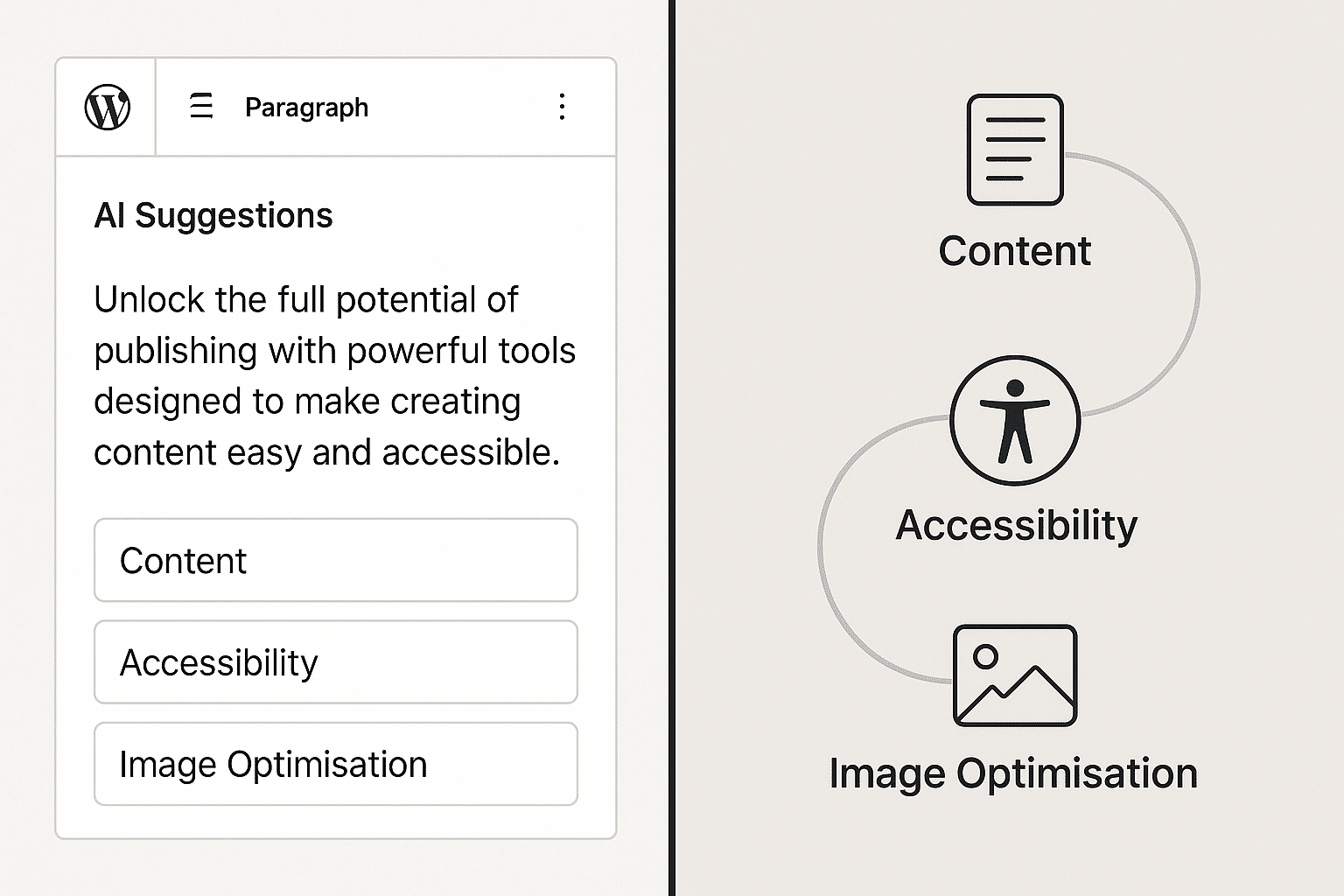
Accessibility isn’t a “nice to have.” It’s the law in many regions, but more importantly, it’s about making the web usable for everyone. The Web Content Accessibility Guidelines (WCAG) set the standard, and following them also improves SEO, usability, and conversion rates.
The most common accessibility fails
- Poor colour contrast: Text that blends into its background.
- Missing alt text: Screen readers can’t describe images.
- Unclear link text: “Click here” is meaningless out of context.
- Inaccessible forms: Missing labels, poor focus styles.
A practical tool: the Colour Contrast Checker
When working with AVE Design, I built a Colour Contrast Checker. It takes two colours, calculates their luminance, and outputs a contrast ratio with WCAG pass/fail results.
The maths:
Contrast ratio = (L1 + 0.05) / (L2 + 0.05)Where L1 is the lighter colour’s luminance, L2 is the darker.
If that ratio is below 4.5:1 for body text, it fails WCAG AA.
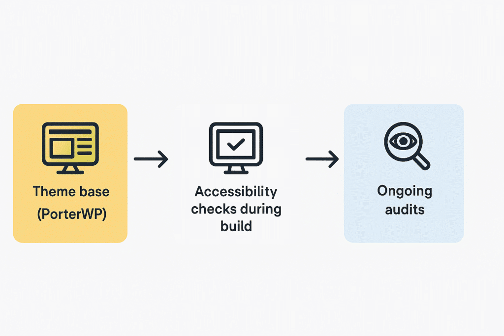
Implementing WCAG in WordPress
- Install an accessibility checker plugin like WP Accessibility.
- Test your colours using the AVE tool or WebAIM’s checker.
- Use descriptive link text (“Download the Annual Report” beats “Click here”).
- Add alt text to all meaningful images.
- Check with a keyboard – can you navigate the whole site without a mouse?
Takeaway checklist:
- Meet WCAG 2.2 AA as a baseline.
- Test colour contrast before design sign-off.
- Choose a theme that’s accessibility-ready.
- Test with both automated tools and manual checks.